
WordPress 3.2 is Here: Born on the 4th of July
July 4, 2011Google Panda Update: 11 Important SEO Facts You Should Know
July 13, 2011by Josh Rubinstein.
Why should you care?
From the time we rise until the wee hours of the night our smart phones are never far from our opposable thumbs. Despite the proliferation of “umpteen” social networks, email still tops out as one of the most common tasks we perform while on the go or at our desks.
The Concept of “The One Web” represents a shift in thought towards “democratically” publishing online content to a range of devices. At Estately, whenever we talk to our customers, we hear that they read our Saved Search alert emails in the “fleeting moments” when a meeting hasn’t quite started or while scarfing down some fruity pebbles cereal in the morning. One of our users told us that in the morning the alarm goes off and, before he’s out of bed, he looks through new emails on his iPhone.
The statistics back this up: no matter what service your company provides, your HTML email needs to be optimized for mobile today – according to Campaign Monitor, the iPhone now accounts for almost 15% of their email subscribers. Heck world-wide Smart Phone activation is outpacing births by 3X!
One HTML template for them All
Part of the goal for the HTML Email template design was to only require the use of one template for both mobile, desktop and anything else the industry creates in the next 6 months for that matter! Approaching design and UX challenges with wearing the lens of Progressive Enhancement in mind makes the world a nicer place!
I didn’t want to depend on CSS3 media queries for content scaling. I wanted to provide as much support to various devices by using percentage widths and max-widths.
Like-wise when CSS3 is supported I figured the device would be responsive enough for advanced stying and design, as you will discover below with my work-in-progress for Retina display support in HTML email.
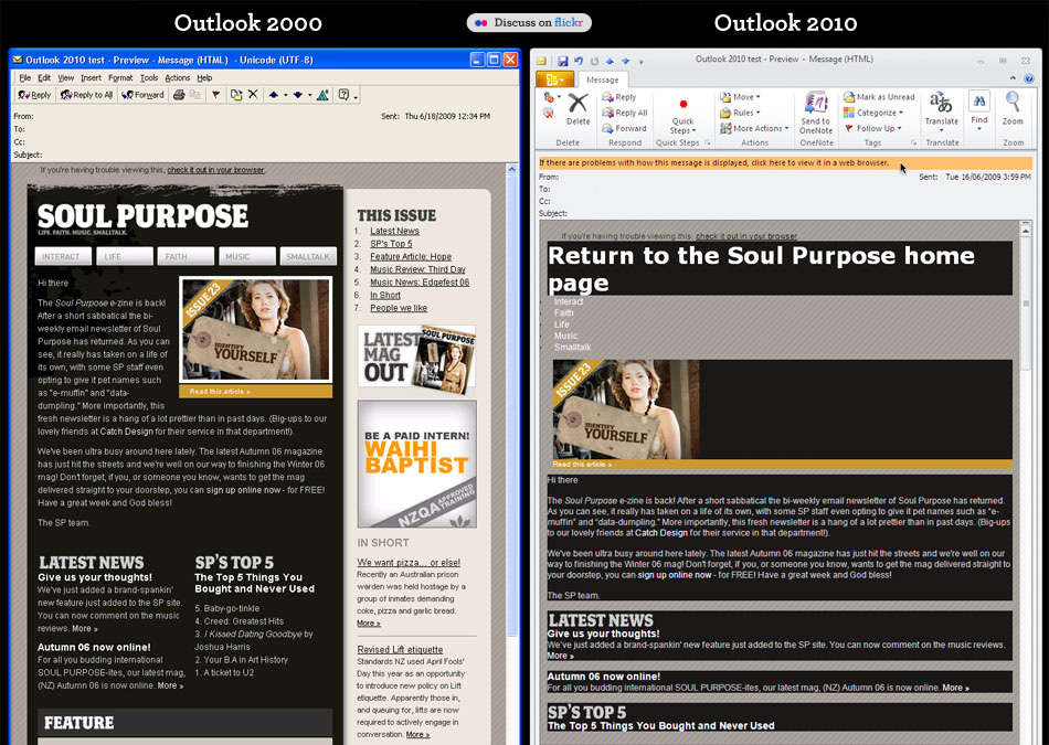
We all know that Microsoft Outlook 2010 and 2007 are crap for rendering HTML. WORD!
Exhibit A, Exhibit B There’s also a few other doosies out there too, checkout Campaign Monitor’s Guide to CSS Support in HTML Email Notice there’s a lot of those red “X’s”.
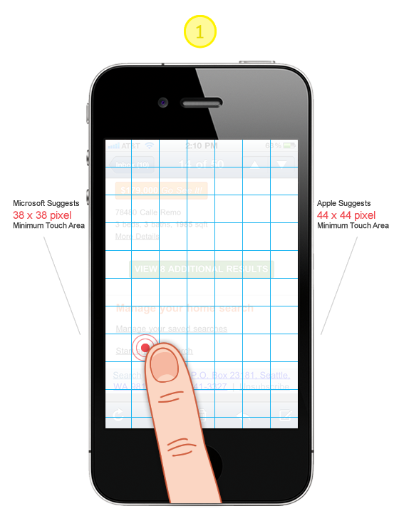
Tip #1: Design all “clicks” to be touch friendly!
Large “Touch Target Sizes” for images, links and buttons will ensure you are a humble champion. There is nothing more frustrating on a slow connection like having to wait for the wrong page to load! Touch Targe Sizes, Accessibility and Ergonomic Guidelines
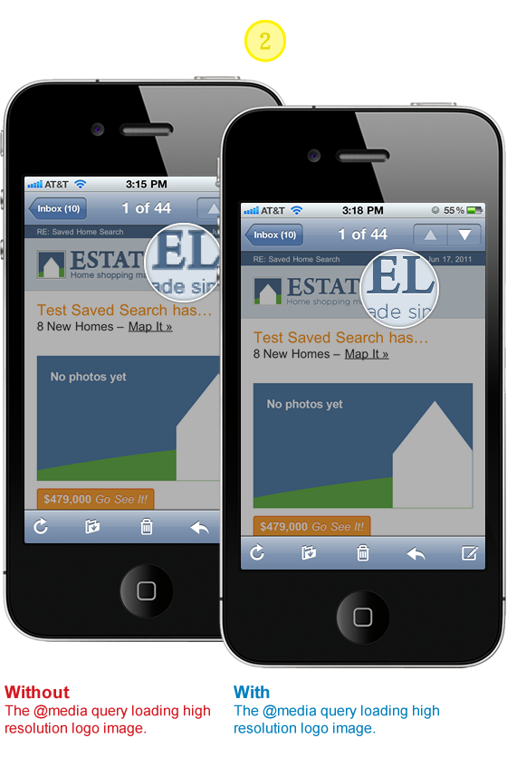
Tip #2: Stunning images on iPhone Retina Display
First impressions are worth taking seriously even if they are a bit more on the subtle side. Will your subscribers stop receiving your emails if your logo is a bit choppy? Don’t compromise if the solution is within reach. I like this approach for supporting the higher resolution displays because all subscribers will see the same content. I aspire to the mantra of Progressive Enhancement. All users will see the ALT text and with images on a logo. If they happen to be using a high resolution display such as the iPhone Retina display they will see a super crisp version of the logo.
HTML
<span style="position: relative; display: block; height: 41px;"> <a href="#" class="logo-link" style="display: block; height: auto; color: #4C6A8B;font-weight: bold; text-decoration: none; text-align: left;"> <b></b> <img style="font-size: 20px; text-align: left; border: none; font-size: 14px; height: 41px; outline: none; text-decoration: none; font-weight: bold;" alt="text for image" height="41" width="200" src="#" /> </a> </span>CSS
Note, you will have to update the image paths and dimensions to work with your content and design.
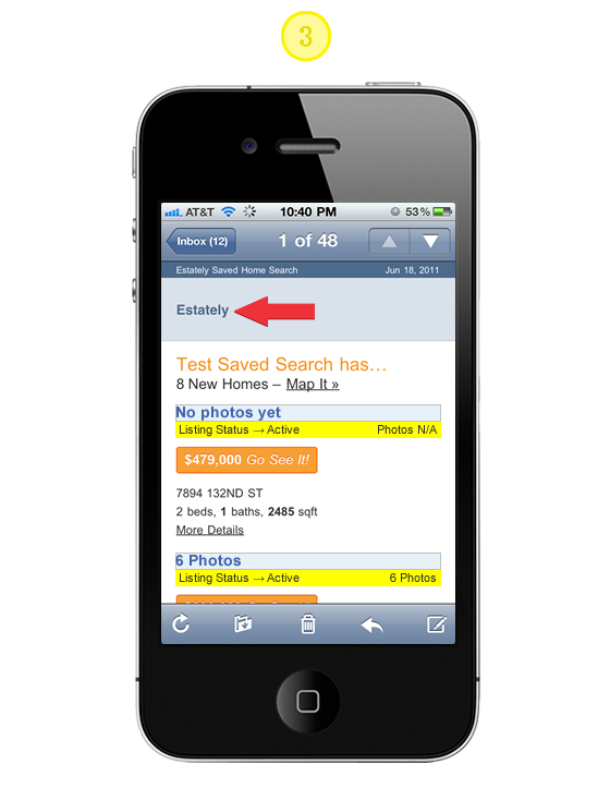
// Yahoo! Mail ignores any styles that use attribute selectors // this helps override it loading @media queries which it give // extreme precedence @media only screen and (-webkit-min-device-pixel-ratio : 1.5), only screen and (min-device-pixel-ratio : 1.5) { a[class = logo-link] b { background: url("https://logo.png") no-repeat 0 0; width: 200px; height: 41px; background-size: 100%; position: absolute; z-index: 10; display: block; } a.logo-link:after { content: "Estately"; position: absolute; top: 0; text-align: left; width: 200px; height: 41px; display: block; } span a[class=logo-link] img#estately { display: none; } }Tip #3: Providing ALT text for background images
Simply add the CSS below to the media query outlined in Tip# 2. Here we are taking advantage of the CSS Pseudo Class :after and the CSS2 content property to add the ALT text for the high resolution imagery.
CSS
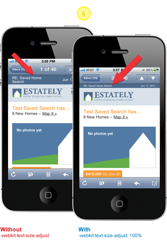
// Yahoo! Mail ignores any styles that use attribute selectors // this helps override it loading @media queries which it give // extreme precedence @media only screen and (-webkit-min-device-pixel-ratio : 1.5), only screen and (min-device-pixel-ratio : 1.5) { a.logo-link:after { content: "Alt text for Logo"; position: absolute; top: 0; text-align: left; width: 200px; height: 41px; display: block; } }Tip #4: Prevent Webkit & Windows Mobile platforms from changing default font sizes
Mobile Safari has a default text size that’s greater than 100%, which can puff up your layout in ways you did not intend. There’s lots of advice out there that suggests by setting -webkit-text-size-adjust to none the problem is solved. There has been some good discussion around this topic and it’s worth reviewing so you don’t blindly implement the following suggestion. If you were to set the property to none desktop WebKit users would loose the capability to “zoom.”
CSS
// Corrects font-size on mobile/handheld devices w/o preventing zooming // in WebKit browsers @media only screen and (min-device-width : 320px) and (max-device-width : 480px) { body { -webkit-text-size-adjust:100%; -ms-text-size-adjust:100%; } } @media only screen and (min-device-width: 768px) and (max-device-width: 1024px) { body { -webkit-text-size-adjust:100%; -ms-text-size-adjust:100%; } } @media only screen and (-webkit-min-device-pixel-ratio : 1.5), only screen and (min-device-pixel-ratio : 1.5) { body { -webkit-text-size-adjust:100%; -ms-text-size-adjust:100%; } }Tip #5: Scaling Images, Responsive Design Approach
Email clients vary in their design and implementation so much. Some are based on antiquated rendering engines and others have umpteen layout options and overloaded “tool belts.” It’s anyones best guess just how much screen area your actual message will be given. I have choosen to use a combination of percentage widths with max-width settings to achieve a layout where images can scale up to 600 pixels wide and down to 350 pixels. It’s not perfect in all clients such as Outlook 2007 and 2010 but the content and utility of the layout are not compromised, while providing a optimal experience for the majority of email clients.
HTML
<body style= "width:100% !important; max-width: 800px; background: #ffffff; margin: 0 auto; padding: 0; color: #4c4c4c; text-align: center;"> <table border= "0" cellpadding= "0" cellspacing= "0" align= "center" style= "width:100%; max-width:600px; background: #ffffff; font-family: Arial, Helvetica, Verdana;"> <tr> <td> <a href="#" style="width: 100%; max-width:600px;"> <img src="image.jpg" alt= 6 Photos border= "0" style= "border: none; font-weight: bold; height: auto; line-height: 100%; outline: none; text-decoration: none; text-transform: capitalize; -ms-interpolation-mode: bicubic; width:90%; text-align: center; background: #E6F1F8; font-family: Arial, Verdana; font-size: 16px;" /> </a> <td> <tr> <table> </body>Tip #5.5: Make Internet Explorer Smooth
Internet Explorer’s default image scaling made your Pentium 266 work, but it today it just makes any scaled image look horrible. Make IE smoother and more sensual by setting image scaling for Internet Explorer to smooth: -ms-interpolation-mode: bicubic;
See CSS Tricks for image examples and further reading.
CSS
// If you use width or height tags to resize images in your markup, // IE will ensure they look incredibly awful unless you use this. -ms-interpolation-mode: bicubic; “You have mail” Demo
Hope the improvements and the code samples got you enthusiastic again about HTML Email. My goal is to help you communicate more effectively and provide the best experience possible for your design and subscribers. I certainly developed solutions for my design needs. You may find it necessary to adapt and explore tweaks and new solutions all together. If you come across any improvements or new solutions please let us know!
Guest Author Info
Josh works with the fine people of Estately, a comprehensive online real estate search for home buyers to shop and tour homes. Josh feeds upon the dynamic between design and development finding inspiration from both communities. When he’s not in front of the computer, you can find he and his wife working on their Seattle home.
this article originaly appeared here… webdesignerwall.com